How to Choose an Interior Colour Scheme for Your Restaurant

With interior design playing such a huge role on the overall experience that customers have with your bar or restaurant, considerations of the colour scheme you choose is incredibly important.
In fact, there is far more to colour than you might initially think. Colours affect a whole spectrum of things, such as mood, energy and appetite.
The psychology of colour is complex, but knowing the basics can help you to shape the perfect environment for your customers.
How to Choose a Colour Scheme: Initial Considerations
What's the Concept Behind Your Restaurant?
Colour has a big impact on mood and an influence on the ambience of a space. Your chosen colours should reflect the type of experience you want your customers to have.
Bright colours are energetic and linked to increased appetite, whereas lighter colours are associated with more calming and serene spaces.
Think about the experience you want to offer customers before deciding on your colour scheme as your choice will end up affecting the cosiness, formality and energy of your space.
What Type of Food Are You Offering?
Your chosen interior colours are all part of your brand, so they should be relevant to what you're selling.
As we covered in our Designing a Restaurant to Reflect its Cuisine blog post, a restaurant's menu items should go hand in hand with its interior to work best and solidify a brand.
A healthy food restaurant, for example, might consider featuring natural and neutral colours to reflect the ethos surrounding a healthy food brand.
Decide on your offerings to get one step closer to discovering the perfect colour scheme for your restaurant!
Keep Your Brand Identity in Mind
Your brand identity should influence your chosen restaurant interior colour scheme.
Everything from your logo to your food and colour scheme should tie together, and featuring your brand colours throughout your establishment is important for strengthening your identity.
The extent to which you feature these colours is completely up to you.
You don't need to go too heavy-handed to create a fantastic branded environment, and you might choose to instead feature more subtle accents of colour throughout your interior.
4 Beneficial Interior Colour Schemes for Restaurants

In addition to the influence of your brand colours on your interior, there are certain colours that work well - and not so well - in a restaurant environment.
You likely don't realise it, but certain colours can increase your appetite, mood and energy. Equally, others can reduce your appetite too!
1. Greens and Earthy Tones
There are many benefits to introducing green and earthy tones throughout your restaurant.
These colours are often found in nature and in healthy food, which helps customers to feel relaxed and content in your interior.
As we previously mentioned, these interior colours fit particularly well with healthy food restaurants and cafes!
2. Warm Reds and Oranges

Reds and oranges are great energetic and happy colours to give your interior an uplifting atmosphere (we're certainly partial to touches of orange here at Absolute!), and reds are associated with an increased heart rate, which contributes to increased hunger and can work in your favour as a business in the food industry!
These colours tend to be best fitted to fast food restaurants, which are likely to come to mind when you think about eateries famous for using reds and oranges.
3. Bright Whites
To use white to its full potential in your restaurant, try and avoid going overboard and instead aim to strike a balance between white and softer tones and materials.
Too much white can appear clinical and cold, but paired with the right furniture and colour accents, it can help your space to feel big, spacious and calm.
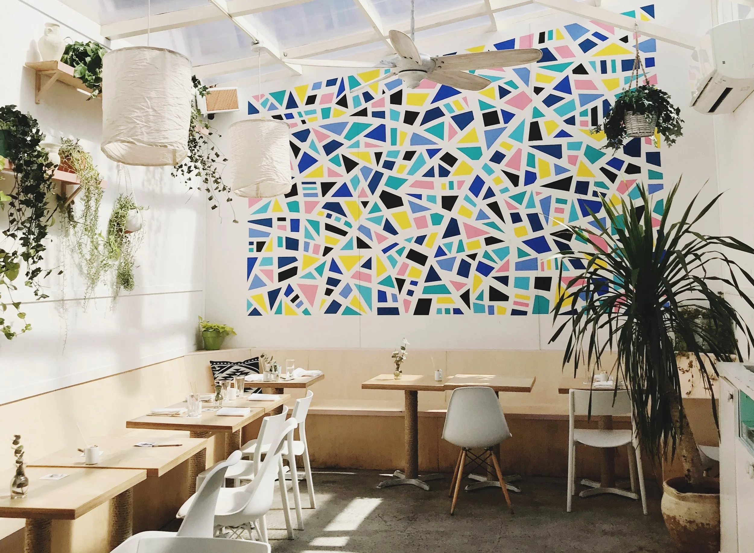
4. Millennial Colours
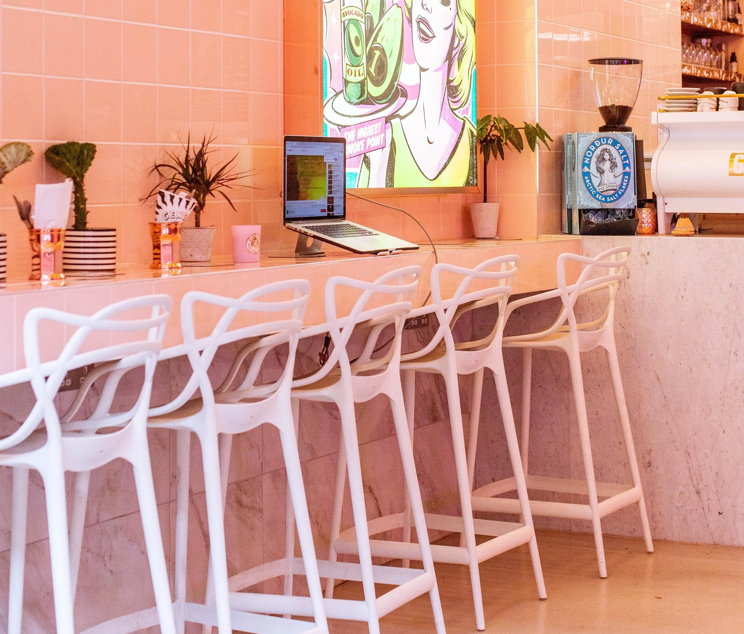
In addition to the more traditional spectrum of colours, restaurant colour schemes have turned a little funkier in recent years, and some might place the blame on millennials!
'Millennial' pinks, pastels and off-greys have shaped the brand identity of many eateries, and they can certainly help your establishment become more 'Instagrammable'.
Although the pinks and pastels might not appeal to you, their popularity is an indication that you can definitely get away with being more experimental with colours in your restaurant.
Don't be afraid to push the boat out if it fits in with your brand!
Ultimately, your restaurant interior colour scheme needs to be bespoke to you and your brand. We can help you to develop a strong visual scheme that complements your offerings and strengthens your brand identity! Take a look at some of the restaurant interiors we've already worked on, and get in touch to chat about your space!


RECENT PROJECTS: